Case study
Case study
Redefining Super App Navigation & Design Strategy
Redefining Super App Navigation & Design Strategy
Background
Imagine a super app that seamlessly connects groceries, movies, travel, and everyday services—all through an AI-powered assistant. That was the vision behind iamai, an ambitious project at MAF. But with 12+ domains, multiple interaction models, and a complex user experience, the challenge was clear: how do we design a navigation system that feels intuitive, scalable, and effortless?
Imagine a super app that seamlessly connects groceries, movies, travel, and everyday services—all through an AI-powered assistant. That was the vision behind iamai, an ambitious project at MAF. But with 12+ domains, multiple interaction models, and a complex user experience, the challenge was clear: how do we design a navigation system that feels intuitive, scalable, and effortless?
Role
Role
Director · Design
Director · Design
Domain
Domain
12+
12+
Stage
Stage
Private Beta
Private Beta
Industry
Industry
AI
AI
Core
team
Core team

Farhan
Farhan
Farhan
Director · Design
Director · Design
Chandra
Chandra
Chandra
CEO iam plus
CEO iam plus
Darren
Darren
Darren
SVP XSIGHT
SVP XSIGHT
Tarek
Tarek
Tarek
Head of iamai
Head of iamai
Alain
Alain
Alain
Marketing Lead
Marketing Lead
Peter
Peter
Peter
Operations
Operations
Shiju
Shiju
Shiju
VP · Engineering
VP · Engineering
Appu
Appu
VP · Product
VP · Product
Jeffrey
Jeffrey
Jeffrey
Director · Strategy
Director · Strategy
The challenge
The challenge
When I joined, the product was already in development, but something wasn’t right. This was more than just a design problem—it was an organizational and strategic challenge.
When I joined, the product was already in development, but something wasn’t right. This was more than just a design problem—it was an organizational and strategic challenge.
Fragmented Experience
Fragmented Experience
The product lacked a unified interaction model, leading to inconsistent experiences across multiple domains. With voice, swipe, gestures, and tap interactions being applied differently across features, users faced confusion and unpredictability in navigation. This inconsistency resulted in higher cognitive load, lower adoption rates, and a fragmented brand experience.
Steep Learning Curve
Steep Learning Curve
Users struggled to navigate and understand the product due to a complex information architecture and inconsistent UI patterns. Key workflows required too many steps, and the absence of progressive onboarding made it difficult for users to adapt quickly. This resulted in higher drop-off rates, increased support queries, and lower engagement.
Users struggled to navigate and understand the product due to a complex information architecture and inconsistent UI patterns. Key workflows required too many steps, and the absence of progressive onboarding made it difficult for users to adapt quickly. This resulted in higher drop-off rates, increased support queries, and lower engagement.
Scalability Issues
Scalability Issues
There was no structured framework to scale design efficiently across 12 different domains (ranging from travel to food to email). Each team built UI components independently, leading to redundant work, inconsistencies, and increased development time. Without a single source of truth, maintaining quality and efficiency across multiple platforms became unsustainable.
There was no structured framework to scale design efficiently across 12 different domains (ranging from travel to food to email). Each team built UI components independently, leading to redundant work, inconsistencies, and increased development time. Without a single source of truth, maintaining quality and efficiency across multiple platforms became unsustainable.
Agency-Style Workflows
Agency-Style Workflows
The design team operated in a traditional handoff model, where designers completed work in isolation before passing it to developers. This approach led to misalignment, last-minute reworks, and delays due to feasibility issues discovered late in the process. Developers felt disconnected from design decisions, impacting overall efficiency and execution speed.
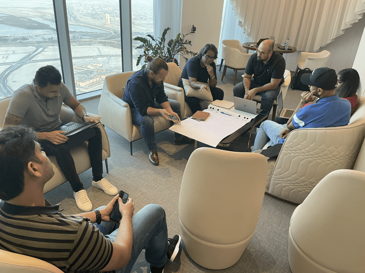
The first step
The first step
Conducted an in-depth usability audit and focus group feedback sessions, identifying misalignments between user mental models and the app’s interaction paradigms.
Conducted an in-depth usability audit and focus group feedback sessions, identifying misalignments between user mental models and the app’s interaction paradigms.

Face is blurred to protect the privacy of the participants
Face is blurred to protect the privacy of the participants
The Strategy: Building the
Right Foundation Before Scaling
The Strategy: Building the Right Foundation Before Scaling
The Strategy: Building the Right Foundation Before Scaling
Realizing that 76% of interactions revolved around Carrefour Grocery and Vox Cinema, I proposed a bold pivot—focus on the two most-used services first, perfect their navigation, and then scale. This not only improved usability but also gave us a replicable framework for the rest of the app.
Realizing that 76% of interactions revolved around Carrefour Grocery and Vox Cinema, I proposed a bold pivot—focus on the two most-used services first, perfect their navigation, and then scale. This not only improved usability but also gave us a replicable framework for the rest of the app.
Core design principles
Core design principles
To align with MAF’s vision of "Creating great moments for everyone, everywhere," we established the following design principles. These principles served as the foundation for our navigation and interaction framework, influencing every design decision.
To align with MAF’s vision of "Creating great moments for everyone, everywhere," we established the following design principles. These principles served as the foundation for our navigation and interaction framework, influencing every design decision.
Effortless
Effortless
Reducing cognitive load.
Reducing cognitive load.
Memorable
Memorable
Familiar mental models.
Familiar mental models.
Magical
Magical
AI-powered, yet intuitive.
AI-powered, yet intuitive.
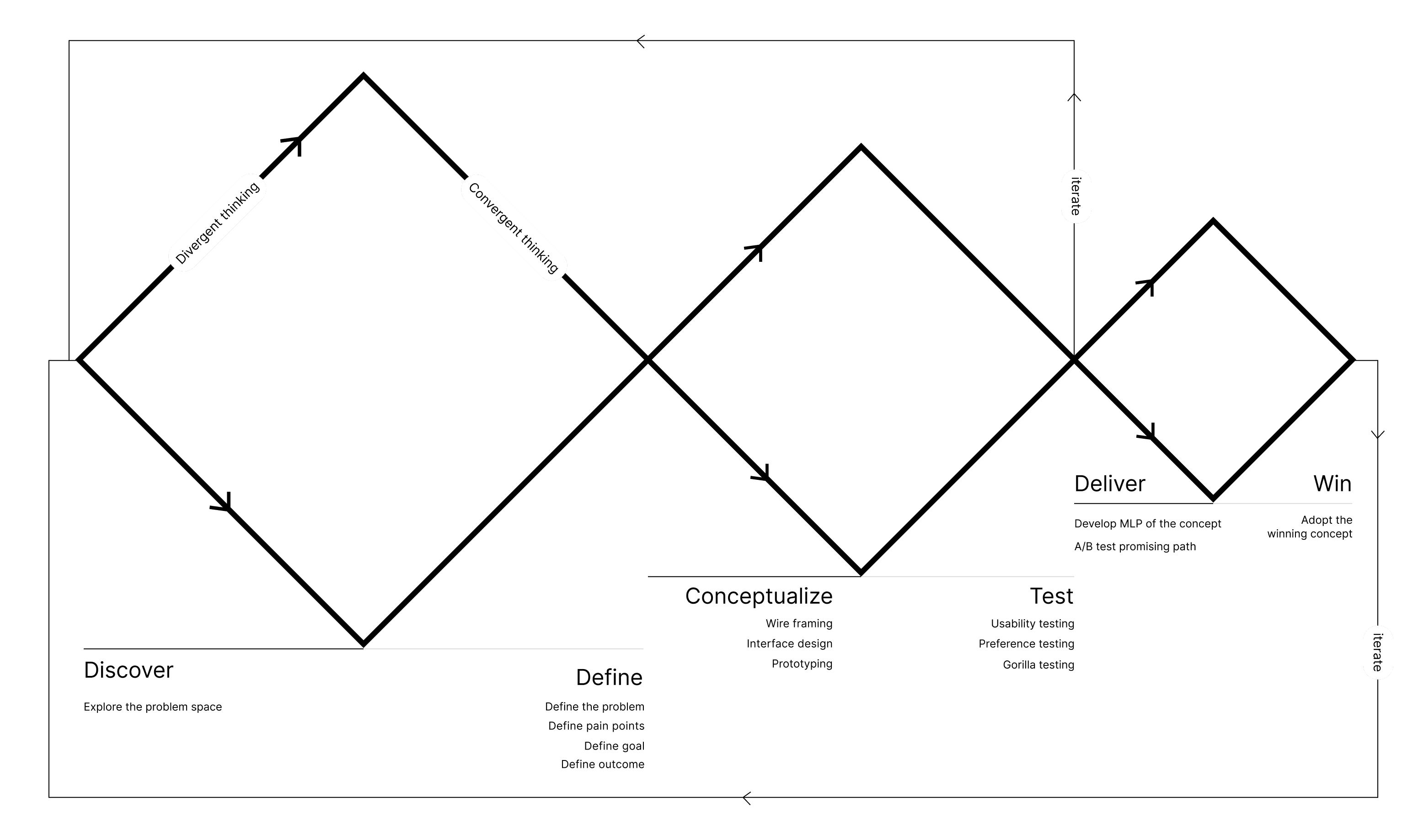
Aligning the Team Around a Unified Design Strategy
Aligning the Team Around a Unified Design Strategy
To address misalignment between design and development and reduce inefficiencies caused by a traditional handoff model, I developed and introduced a Triple Diamond Design Framework. This extends the Double Diamond model by integrating iterative delivery, rapid testing, and continuous feedback loops, ensuring that we focus on delivering high-impact, validated features rather than just final designs.
By embedding Conceptualization, Testing, and Iteration within the process, we shifted from a handoff-based workflow to a collaborative, iterative approach where designers, engineers, and researchers worked together from ideation to execution. This not only improved team efficiency but also reduced rework, allowing us to refine solutions based on real-world user feedback before full-scale development.
Super App interaction Framework
Super App interaction Framework
Streamlined and defined a three-tiered interaction system, giving users the flexibility to engage in ways that matched their mental models:
Streamlined and defined a three-tiered interaction system, giving users the flexibility to engage in ways that matched their mental models:
Tap & Hold for Voice
Tap & Hold for Voice
Tap & Hold for Voice
The original AI-first method, but simplified and refined.
The original AI-first method, but simplified and refined.
The original AI-first method, but simplified and refined.
Type & Interact
Type & Interact
Type & Interact
A keyboard-based alternative for accessibility.
A keyboard-based alternative for accessibility.
A keyboard-based alternative for accessibility.
Tap for Direct Actions
Tap for Direct Actions
Tap for Direct Actions
A familiar, traditional navigation for ease of use.
A familiar, traditional navigation for ease of use.
A familiar, traditional navigation for ease of use.
Navigation Framework
Navigation Framework
To address inconsistencies in user navigation across multiple domains, we developed a unified navigation framework that ensured seamless movement throughout the app. Previously, interaction patterns varied across features, making navigation unpredictable and increasing cognitive load.
By leveraging existing mental models from regional apps, we designed a system where tap and type actions functioned consistently, providing users with an intuitive way to explore.
1 of 12
1 of 12
Home to domain
navigation
Home to domain
navigation
The animation mimics that of the real world as you enter and exit a physical room. All domain screens to have a back icon to get back.
The animation mimics that of the real world as you enter and exit a physical room. All domain screens to have a back icon to get back.
The Navigation Impact
The Navigation Impact
Once the navigation framework was defined, we implemented it on Carrefour for the pilot testing across our focus group of 300+ private beta users of the app.
Once the navigation framework was defined, we implemented it on Carrefour for the pilot testing across our focus group of 300+ private beta users of the app.
2.2x faster: Reduced the number of steps to complete a task significantly with the new framework while still keeping it easy to use.
80% preferred: Users preferred the new hybrid interaction model over voice or tap only.
Cognitive Load Reduction: The navigation overhaul reduced task completion time by 30%.
This framework established a predictable back-navigation pattern across all domains, reducing friction and allowing users to focus on their tasks rather than learning new navigation rules. By enforcing consistency, clarity, and ease of use, we significantly reduced confusion, improved engagement, and streamlined the overall user experience across the ecosystem
This framework established a predictable back-navigation pattern across all domains, reducing friction and allowing users to focus on their tasks rather than learning new navigation rules. By enforcing consistency, clarity, and ease of use, we significantly reduced confusion, improved engagement, and streamlined the overall user experience across the ecosystem
Establishing a scalable design system
Establishing a scalable design system
Build the design system using atomic principles and tokens in mind. The plan was to effortlessly support the changing of themes. This became the single largest library of components within MAF. Later the system setup was also used in other MAF apps making it a role model for across the company.
Figma didn’t natively supported tokens this year. So we’ve used token studio at the time to do the heavy lifting.
I personally developed all tokens, components, and interactions for Carrefour and VOX. Subsequently, I trained the team to extend these elements across all 12 domains, ensuring consistency and significantly reducing development and QA efforts.
I personally developed all tokens, components, and interactions for Carrefour and VOX. Subsequently, I trained the team to extend these elements across all 12 domains, ensuring consistency and significantly reducing development and QA efforts.
Business & Product Impact
Business & Product Impact
Impact of a Scalable Design System Across 12 Domains (Travel, Food, Email, etc.)
Impact of a Scalable Design System Across 12 Domains (Travel, Food, Email, etc.)
Consistency Across Domains: A unified experience across travel, food, retail, email, and more, strengthening brand identity and user familiarity.
Reduced Development & QA Costs: Standardized components and tokens reduce redundant design and development cycles, saving time and engineering resources.
Faster Go-to-Market: New products and features can be shipped faster with pre-built, reusable components.
Faster Go-to-Market: A single source of truth ensures WCAG-compliant, accessible designs across all platforms.
Scalability & Future-Proofing: A flexible system that can integrate new industries, partners, and use cases with minimal effort.
Team Impact
Team Impact
This balance between structure and flexibility allowed the design system to scale effectively while empowering the team to innovate without restrictions.
This balance between structure and flexibility allowed the design system to scale effectively while empowering the team to innovate without restrictions.
Increased Efficiency: Designers spent less time recreating components and more time solving higher-level problems.
Cross-Team Collaboration: A shared language and framework improved collaboration among product, marketing, and engineering teams.
Easier Onboarding & Scaling: New designers ramped up quickly with clear documentation, tokens, and patterns, reducing friction in hiring and training.
Empowered Design Culture: With a solid foundation in place, the team could push boundaries with motion, AI-driven interfaces, and personalization without worrying about inconsistencies.
Leadership & Scaling: Growing the Design Team from 1 to 14
The Strategy: Building the Right Foundation Before Scaling
The Strategy: Building the Right Foundation Before Scaling
Building a high-performance design team wasn’t just about hiring more people. It was about fostering a culture of trust, ownership, and adaptability. I brought in specialists in interaction design, 3D, and motion, and introduced a structured yet flexible workflow. We shifted from a handoff model to a deeply integrated collaboration with product and engineering. This reduced design-development friction and allowed us to move faster with higher quality.
Building a high-performance design team wasn’t just about hiring more people. It was about fostering a culture of trust, ownership, and adaptability. I brought in specialists in interaction design, 3D, and motion, and introduced a structured yet flexible workflow. We shifted from a handoff model to a deeply integrated collaboration with product and engineering. This reduced design-development friction and allowed us to move faster with higher quality.
How I Built the Team
How I Built the Team
Hiring Priorities: Recruited product designers as well as specialists in interaction design, 3d, and motion to work alongside to produce the best experience that works.
Collaboration Model: Introduced cross-functional product squads, ensuring that designers, engineers, and product managers worked in sync.
Efficiency Boost: Reduced design-development friction with a token based design system as well as aligning sprint cycles and weekly design critiques.
Outcome: Within a year, the team grew to 14 designers, and I was promoted to Director of Design, overseeing the entire experience strategy for the project.
Leadership & Management Style: Scaling with Trust & Adaptability
The Strategy: Building the Right Foundation Before Scaling
The Strategy: Building the Right Foundation Before Scaling
As I scaled the iamai super app design team from 1 to 14 designers, I knew that great products aren’t just built through processes—they’re built through people.
As I scaled the iamai super app design team from 1 to 14 designers, I knew that great products aren’t just built through processes—they’re built through people.
My Management Philosophy: Trust First, Adjust Later
My Management Philosophy: Trust First, Adjust Later
I start every designer at 100% trust, believing in autonomy and ownership rather than micromanagement. My leadership approach is not one-size-fits-all—instead, I adapt based on:
I start every designer at 100% trust, believing in autonomy and ownership rather than micromanagement. My leadership approach is not one-size-fits-all—instead, I adapt based on:
Performance: I evaluate work based on impact, clarity, and execution speed, not just effort.
Individual Needs: Some designers thrive with autonomy, while others need structured guidance.
Situational Adaptability: When someone is stuck, I step in, help them recalibrate, and get them back on their feet.
Fostering a Culture of Ownership & Growth
Fostering a Culture of Ownership & Growth
I encourage trial and error—failure isn’t punished but seen as an opportunity to learn.
I create a psychologically safe environment, where designers feel empowered to make decisions.
I ensure no one gets left behind—whether it's a junior designer needing mentorship or a senior struggling with strategic alignment.
Final Thoughts
Final Thoughts
While the iamai super app didn’t officially launch due to partnership and technical challenges, our work had a lasting impact:
While the iamai super app didn’t officially launch due to partnership and technical challenges, our work had a lasting impact:
Positioned MAF as a leader in AI-driven digital experiences.
Influenced Carrefour & SHARE’s core features.
Proved that great design can drive strategic business impact.
Positioned MAF as a leader in AI-driven digital experiences.
Influenced Carrefour & SHARE’s core features.
Proved that great design can drive strategic business impact.